Help and blog management
It has been over a year since the publication of this blog/coursework, if anyone is looking for advise or help on how to maximise their marks, please add me on facebook, that is Chris Mad-Eze, or email me at chukaeze@hotmail.co.uk, thank you.
Construction
Film Trailers
Teaser Trailer:
This is the very first set of footage that was filmed. We were advised to make a teaser trailer in order for audiences to see differences between this and a theatrical trailer, this version should only be considered as a prototype or draft with the primary use of comparison, as there are various issues such as the failure to establish plot.
Theatrical Trailer:
First draft:
Our first draft of our trailer was successful with establishing the correct running time. However this raised a multiple number of issues which lead to our trailer losing effectiveness as well as failing to establish some codes and conventions.
*After the production logo there is no caption which says "Presents" or "A film by"
*The time on the bottom right hand corner (23:54) was irrelevant
*Captions are difficult to read, exceed the conventional limit (they are too close to the side of the screen) and are not conventional captions used in real media text
*Pacing of the trailer sags, meaning that there is no increase in tension, therefore genre is not established
*Sound of the scream after "He killed me!" is distorted, feedback from sound professionals explained that this has a danger to subvert our trailer genre into a comedy
*Name of the director is normally not shown in a trailer but in a film opening
*Some captions were spelled incorrectly
*No super imposing caption highlighting the date or "Coming soon" Or it is difficult to notice at the end of the trailer (bottom right hand corner)
*The brightness of the trailer in some specific scenes are overwhelmingly low and difficult for the audience to see, particularly the scene in the sitting room and most problematically in the forest, where we were forced to use the sepia special effect in order to clarify and establish a flash back.
Second draft:
After accurately and approximately cutting away sixty seconds of our trailer, we were finally able to establish our designated genre more effectively than our first draft. We altered the pacing by making the panning of the sitting room much quicker than before, we also altered pacing through editing, research and feedback from experts made us realise that when trying to create a thriller or horror trailer/film there should be some kind of tempo I.E (1..2..3..4..5 CUT, 1..2..3..4..5 CUT) that should be followed in order not to make the trailer sag. We also added attempted to add a jump scare at the end of our trailer with a caption saying "Coming soon" which again reinforces the establishment of a typical trailer, however there were still a few issues that needed to be addressed.
*The production logo (Mystical Entertainment) reads "PRODC" (for production) and we were advised to remove that caption and just leave it with "Mystical, Entertainment, presents"
*We attempted to add stars in our captions, in this case "Aaron Onojaife" and "Ken Eze" However further feedback made us realise that the establishment of stars or main actors are only established when the actors are well known to the viewers or audience
*Again some captions were spelled in correctly
*The cutting jump scare at the end of the trailer contains a special effect of colour reduction and sepia which creates a very reddish/silver visual, this was proven ineffective from various viewers and critics, we learned that the effect made the antagonist look like a superhero (The silver surfer from fantastic four)
*We were still unable to solve the brightness issues which seriously affected the sitting room and forest scene
Third draft:
After re-editing our trailer for the third time we were again successful with improving the effectiveness of our trailer. The logo of our production company "Mystical Entertainment" followed the conventions of actual production company logos, the captions were finally established correctly with no spelling errors and the cutting jump scare at the end of the trailer was re-effected with a colour reduction and black/white effect making the trailer look more like a thriller. However there were still issues that were raised with this draft.
*Although we used captions correctly like a real media text, we used the conventions more than once which was personally considered to be incorrect. In this case we had the caption saying "From the creators of The Last Word" and "The ones who brought you 'Dilemma' "
*Again we were still unable to resolve the brightness issue which affected the sitting room and forest scene
*There was a problem with a draft that is not present, we created a caption explaining "Evil has a new name" Followed by "Its", feedback from critics made us notice that "its" was a connective and therefore had to change it to "it's"
Final draft:
This draft removes all of the issues that are highlighted in the first draft, However it is advised that it is viewed on a screen which has brightness levels moved up to at least one fourth or one half of the on the metre, we could have increased the brightness on the settings of the youtube player however we believed that it may have damaged the visual graphics of our trailer.


Film Poster

Magazine Front Cover
First draft:
Our first draft of our media magazine was successful with the establishment of some common codes and conventions, however the main problem with this draft was that a very typical element with the main character is that the viewers are able to recognise his/her face. Therefore we had to alter our ideas and make another magazine which is closer to the codes and conventions of film magazines.

Second draft:
Our second draft was more successful with following the codes and conventions, here the viewers are able to recognise one of the main characters in the film unlike the first draft which was ambiguous, however after receiving feedback we found out that the action the character is performing (holding a knife to his throat) does not seem to fit with the front cover of the magazine. Furthermore we also found out that there were a few issues with the text and font size, where some elements were difficult to read.

Third draft:
*Minor word displacement on the bottom text of the magazine, should say "One of the top ten films of the year"

Final draft:

Teaser Trailer:
This is the very first set of footage that was filmed. We were advised to make a teaser trailer in order for audiences to see differences between this and a theatrical trailer, this version should only be considered as a prototype or draft with the primary use of comparison, as there are various issues such as the failure to establish plot.
Theatrical Trailer:
First draft:
Our first draft of our trailer was successful with establishing the correct running time. However this raised a multiple number of issues which lead to our trailer losing effectiveness as well as failing to establish some codes and conventions.
*After the production logo there is no caption which says "Presents" or "A film by"
*The time on the bottom right hand corner (23:54) was irrelevant
*Captions are difficult to read, exceed the conventional limit (they are too close to the side of the screen) and are not conventional captions used in real media text
*Pacing of the trailer sags, meaning that there is no increase in tension, therefore genre is not established
*Sound of the scream after "He killed me!" is distorted, feedback from sound professionals explained that this has a danger to subvert our trailer genre into a comedy
*Name of the director is normally not shown in a trailer but in a film opening
*Some captions were spelled incorrectly
*No super imposing caption highlighting the date or "Coming soon" Or it is difficult to notice at the end of the trailer (bottom right hand corner)
*The brightness of the trailer in some specific scenes are overwhelmingly low and difficult for the audience to see, particularly the scene in the sitting room and most problematically in the forest, where we were forced to use the sepia special effect in order to clarify and establish a flash back.
After accurately and approximately cutting away sixty seconds of our trailer, we were finally able to establish our designated genre more effectively than our first draft. We altered the pacing by making the panning of the sitting room much quicker than before, we also altered pacing through editing, research and feedback from experts made us realise that when trying to create a thriller or horror trailer/film there should be some kind of tempo I.E (1..2..3..4..5 CUT, 1..2..3..4..5 CUT) that should be followed in order not to make the trailer sag. We also added attempted to add a jump scare at the end of our trailer with a caption saying "Coming soon" which again reinforces the establishment of a typical trailer, however there were still a few issues that needed to be addressed.
*The production logo (Mystical Entertainment) reads "PRODC" (for production) and we were advised to remove that caption and just leave it with "Mystical, Entertainment, presents"
*We attempted to add stars in our captions, in this case "Aaron Onojaife" and "Ken Eze" However further feedback made us realise that the establishment of stars or main actors are only established when the actors are well known to the viewers or audience
*Again some captions were spelled in correctly
*The cutting jump scare at the end of the trailer contains a special effect of colour reduction and sepia which creates a very reddish/silver visual, this was proven ineffective from various viewers and critics, we learned that the effect made the antagonist look like a superhero (The silver surfer from fantastic four)
*We were still unable to solve the brightness issues which seriously affected the sitting room and forest scene
After re-editing our trailer for the third time we were again successful with improving the effectiveness of our trailer. The logo of our production company "Mystical Entertainment" followed the conventions of actual production company logos, the captions were finally established correctly with no spelling errors and the cutting jump scare at the end of the trailer was re-effected with a colour reduction and black/white effect making the trailer look more like a thriller. However there were still issues that were raised with this draft.
*Although we used captions correctly like a real media text, we used the conventions more than once which was personally considered to be incorrect. In this case we had the caption saying "From the creators of The Last Word" and "The ones who brought you 'Dilemma' "
*Again we were still unable to resolve the brightness issue which affected the sitting room and forest scene
*There was a problem with a draft that is not present, we created a caption explaining "Evil has a new name" Followed by "Its", feedback from critics made us notice that "its" was a connective and therefore had to change it to "it's"
This draft removes all of the issues that are highlighted in the first draft, However it is advised that it is viewed on a screen which has brightness levels moved up to at least one fourth or one half of the on the metre, we could have increased the brightness on the settings of the youtube player however we believed that it may have damaged the visual graphics of our trailer.
Wrong setting
Preferred setting
Best setting


First draft:
Our first draft of our media magazine was successful with the establishment of some common codes and conventions, however the main problem with this draft was that a very typical element with the main character is that the viewers are able to recognise his/her face. Therefore we had to alter our ideas and make another magazine which is closer to the codes and conventions of film magazines.

Second draft:
Our second draft was more successful with following the codes and conventions, here the viewers are able to recognise one of the main characters in the film unlike the first draft which was ambiguous, however after receiving feedback we found out that the action the character is performing (holding a knife to his throat) does not seem to fit with the front cover of the magazine. Furthermore we also found out that there were a few issues with the text and font size, where some elements were difficult to read.

Third draft:
*Minor word displacement on the bottom text of the magazine, should say "One of the top ten films of the year"

Final draft:

Evaluation
In what ways does your media product use, develop or challenge forms and conventions of real media texts?
*Apologies for the low quality of the video, it will be advised to raise the volume in order to hear what is being said.
Film Trailer
Our media products consist of three media elements I.e a theatrical trailer, a film poster and film magazine, all of which use as well as challenge codes and conventions of real media texts. When evaluating the our trailer, conventions such as the length of real media trailers are broken or slightly altered, for example research on textual analysis suggests that modern theatrical trailers such as the ones shown on our blog site (One missed call, Horsemen, And Devil) have the average running time of two minutes and thirty seconds. Originally, that was the planned length of our trailer and there is a draft on our main task section which shows that it has a similar running time as a typical media text, however due to many issues that occurred with the trailer such as the de-synchronization of tempo, incorrect usage of titles and imperfect camera footage, the trailer had to be re-edited in order to decrease the length down to one minute and thirty seconds, which is a length that could consider the trailer to be more of a teaser, rather than a theatrical. This information was again gathered from our textual research, from our chosen teaser trailers we have found that the average running time was one minute and thirty seconds.


*This is an example of our the running time of our theatrical trailer (draft) and the theatrical trailer of the film “Devil”. As you can see our original trailer had a similar running time with an existing media text.


*This is an example of our re-edited theatrical trailer and the existing teaser trailer “Freddie Vs Jason”. As you can see, after editing our trailer the running time has become geared towards a teaser trailer, therefore challenging the codes and conventions of a theatrical trailer.
When looking at the format and setting of our trailer it can be said that it follows the codes and conventions of real media products. Meaning that the typical format of a horror/thriller trailer is what is being established by our product. Like all trailers in general our trailer begins with audience information, where the film rating is being transmitted to viewers, however this application is open to debate, the information slide being used in our trailer is rated by the motion picture association of America (MPAA) meaning that it is not following the codes and conventions for a trailer being released in the United Kingdom. When reviewing this issue whilst editing we found that trailers being released in the UK do not contain any disclaimer information prior to the beginning of an advertised trailer, with the exception of the information given to audiences prior to the beginning of a film in the cinema
*The film trailers above are examples of both modern trailers and trailers that were released during the twentieth century, all of which have been released in the UK and do not contain any information regarding film ratings or disclaimer information. There fore it can be argued that our media product successfully follows this particular convention, however at the same time our trailer also challenges the convention of disclaimer audience information when comparing British trailers


*As you can see on the first draft (magazine on the left) it is difficult to recognize the facial features or expressions of the main antagonist, therefore we had to edit our magazine and establish one use of the typical codes and conventions in a film magazine.

*Here are the examples of the inciting subheadings used on our magazine front cover


Another convention that is followed by our film trailer is the use of jump cuts or “jump scare” directly or shortly after the title of the film is established. This is typical of horror, thriller, or horror/thriller genre films, the climax of the trailer raises the tension of the scene whilst the title brings the tension to an end, almost like a full stop. Finally a small piece of footage from the film is used as a short burst which is designed for the purpose of scaring the viewers watching the trailer, and any additional of information such as websites or post-production companies are shown immediately after the jump scare.
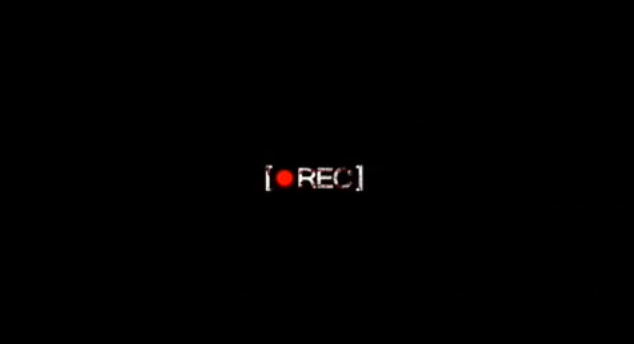
“REC.” jump scare example


“Final destination” jump scare example


“Insidious” jump scare example


Magazine Front cover.
Our magazine front cover is based on various ideas which were taken from original existing ideas of the “Empire” magazine, and ideas front portfolios which were created in the last A2 group. The reason why we decided to merge these two ideas together was because we believed that both ideas would create the type of theme which will establish symmetry between our magazine and our theatrical trailer. On the first draft of our magazine we knew that to establish one of the codes and conventions we would need a master picture which would be cropped and placed unto a background, we took the idea of the joker from batman on the front of the empire magazine where he is sitting down on a chair. The idea was significantly good, however we found out that our magazine was subverting one of the codes of conventions, when the picture of the main antagonist (blist) was looking down, and the viewers were not able to see recognize the facial features. We learned that viewers are usually able to see the facial features of characters in the magazine, therefore we had to use a different picture for our main character/antagonist, we decided to use the picture where the antagonist is facing the audience with a knife on his throat to establish the codes and conventions more effectively.


*As you can see on the first draft (magazine on the left) it is difficult to recognize the facial features or expressions of the main antagonist, therefore we had to edit our magazine and establish one use of the typical codes and conventions in a film magazine.
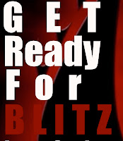
The subheadings that are used in our magazine front cover follow the typical codes and conventions of a typical film magazine. They emphasize the exclusive content of our magazine by giving the viewers information regarding the magazine content. Some of our written text explain “Get ready for Blitz” and “Get killing or die hard.” These are examples of texts that are used, which follow the typical rules because they incite the viewers to look deeper into the magazine.


*Here are the examples of the inciting subheadings used on our magazine front cover
Any further conventions that are used would be the bar code and pricing of the of the Empire magazine, we simply copied and cropped one of the template titles and added it to the top of our magazine again the catch phrase “The worlds biggest movie magazine” was already present in the template, which helped with the reinforcement of codes and conventions. There is also a tag on the bottom right hand corner which highlights some kind of exclusive or luxury feel, the tag is a rating which says “Why so serious? Beware the joker", a subliminal tag that again adds excitement to the magazine


*This shows the different elements used to establish the codes and conventions of the magazine
The final point about the magazine front cover is what challenges the rules of a typical magazine. For our background we decided to use the logo of our production/distribution company I.E the black and red dragon, this is normally not established by existing titles, however when we were cropping our main character unto a black background, the results were too plain and therefore we had to improvise.

*Heres an example of the background that we used for our magazine which is our main logo for our production company.
Film Poster


How effective is the combination of your main task and ancillary text?


What have you learned from audience feedback?
How have you used new media technologies for the research, planning, construction and evaluation stages?
Film Poster
Like our magazine front cover, our film poster is based on ideas taken from original film posters, particularly in the layout of text, the placing of the title, credits, slogan and release date, we attempted to use these ideas in the hope that we may establish the codes and conventions more accurately. From our research we found that Film posters should contain a focal image which is catching to the eye of the viewer and may highlight a theme from the trailer as well as give an idea of the genre. We decided to take recreate an image from the master scene in our trailer where the main antagonist is psychologically constraining the protagonist in the sitting room, however we only included the antagonist because usually the protagonist and antagonist would not be present in the same shot. Furthermore we also had the antagonist spinning the knife, looking at the table with a straight face, darkened the edges on the bottom right and top left hand corner in order to establish antagonism and genre.

*This is an example shot that inspired our idea for our poster, again we decided to use it in order to relate our image to the film trailer.

*The layout of our text was inspired by the poster of the film Watchmen, as you can see the title is placed on the left hand side facing down which is what our poster attempts to follow.
The layout of our credits on the bottom right hand corner also attempt to follow the codes and conventions of film posters. The fonts and varied font sizes which are used make our product look like a typical poster, furthermore the elements that are included in the text such as the company, producer, director and actors etc help to add value to our poster being like a real existing product.

*This is an example taken from our final poster which shows the credits which tell the viewer information regarding the production and creation of the film.
Finally, our poster may attempt to follow the codes and conventions of real media texts however the placing of the title and slogan may be left to dispute. Originally it can be said that the poster is following a typical rule however not often is the title placed in that manner, nor does the slogan attempt to interact with the focal image, However we decided to establish this in order to make our work unique and more presentable to the viewer.


*This shows the placing of the poster title and slogan, as you can see the positioning of these texts is quite unusual and does challenge the codes and conventions of real media texts
How effective is the combination of your main task and ancillary text?
First let’s distinguish what our main task and ancillary texts are. Our main task is our film trailer (theatrical) from our construction section of our blog, while the ancillary texts consist of both our film poster and film magazine (Empire).
Having a successful combination between the main task and ancillary texts is a sign of having a strong marketing campaign. It has been proven time and time again with film marketing in the past that the advertising package can make or break a film regardless of how good the film is itself. An example would be the film paranormal activity 3; this film’s trailer and poster are an excellent example of using a colour scheme, iconic characters, font, film title design, and use of taglines while keeping them the same throughout each piece of media. For example their poster:

Their Trailer:
Now that we have an example to refer back to, does our main task and ancillary text do as well?
Well in terms of colour scheme we have successfully kept them the same throughout without having to compromise on their effectiveness. The effectiveness of our packages all depend on whether they can represent or display the theme/tone. To be more elaborate, it would not help that your colour scheme consists of bright colours like yellow when your objective is to create a horror trailer. Because of this we knew we had to use dark colours, but then the problem with this is that the ancillary tasks like the poster may end up dull making it unattractive to audiences at first glance. In the end we decided to use the two colours red and black. They are very simple colours but quite effective in terms of capturing the right theme.


Another element that needs to be addressed is the fact that there needs to be an iconic character to can be linked to all the other media packages. For example when our target audiences watch our trailer and then happen to walk past our poster, we want them to immediately see the connection. As such our poster not only had to have an iconic character but had to show influence from the trailer itself. As you can see from the comparable profile I have mentioned before.


These two characters within these posters are very well known by audiences who have watched the 2 previous paranormal activities before it. They are known as the victims and possibly the cause for all the unnatural events. Because of this, audiences will feel on a much more personal level with the film poster.
So before me and my partner produced our ancillary texts we had to decide who or what was going to be the face of our film promotion. After various discussions we decided to use the main antagonists from our film trailer “Blist”. This was because in horror posters you would normally see the threat that will be portrayed in the film, or the victim of the film usually the protagonist. But you would not see them in the same shot together. So we had to make a choice and it only seem logical to choose our antagonist as we thought about our protagonist being portrayed on our empire magazine and it did not give off the flair needed to sell the magazine to our target audience. So whatever personality that was created within the trailer had to be shown on our ancillary texts. As you can see these were done correctly, and the character is wearing the same costume throughout.


For our film title design we decided to take a different route from the stereotypical font used for film titles that incorporate the colour red, that stereotype being blood dripping down from the film title.
Instead we decided to make the title of our film feel like it belonged instead of copying a trend. As you can see our film title has the “shadow” effect in place, this was done to represent the main protagonists schizophrenia (where you see things that are not there), thus the shadow. The same effect was used for our master photo from the poster, to coincide with the film title.


Our logo that appears on the magazine, and in trailer, this is the logo for mystical entertainment (the production company we came up with for the film).

For our films tagline we had finalised it down to “Evil has a new name...” this was done because it was short and took the right approach in capturing the audience’s attention. It was the type of tagline that would leave audiences wanting to know what they meant when the poster says “Evil has a new name”.


What have you learned from audience feedback?
How have you used new media technologies for the research, planning, construction and evaluation stages?
Subscribe to:
Posts (Atom)